Brand
Iiwari brand guidelines
A short guide to how Iiwari looks and sounds. It is meant for partners, media and our own team. Questions and logo requests: kaarina.paivinen@iiwari.com
Brand
Logos
The Iiwari logo is the company mark. The Iiwari Care logo is the renewed mark of the nurse call system. Always use the original file – never redraw or retype the logo.


How to use it
- Clear space around the logo is at least the height of the letter i on every side.
- Minimum size is 96 px wide on screen and 25 mm in print.
- Place the logo on a light, calm background. On dark backgrounds use the white version.
- Iiwari Care is always written as two words with capital initials.
How not to use it
- No stretching or condensing – proportions never change.
- No colour changes, gradients, shadows or outlines.
- No logo on a busy photo or a dark overlay.
- No locking the logo together with another mark or word into one symbol.
Brand
Colours
Light surfaces are the base, navy carries the text and orange works as an accent. Use orange sparingly: buttons, highlights and small markers – never as a large fill.
Accent, buttons, highlights
Headings, body text, dark cards
Lead paragraphs and secondary text
Light section background
Cards and base background
Always check contrast: text against its background needs at least 4.5:1 (3:1 for large headings). Orange is not used as small body text on white.
Brand
Typography
Aktiv Grotesk is the only typeface we use. Headings are medium weight with slightly tightened letter spacing, body text is regular with generous line height. Fallbacks are system fonts (system-ui, Segoe UI, Roboto).
Brand
Imagery and icons
Our photos are real moments from everyday care, indoors: natural light, calm colours and people at the centre. Avoid staged scenes, stock-photo smiles and dark overlays. Screens of the Iiwari Care app are always real product images, never illustrations.
Use images like these


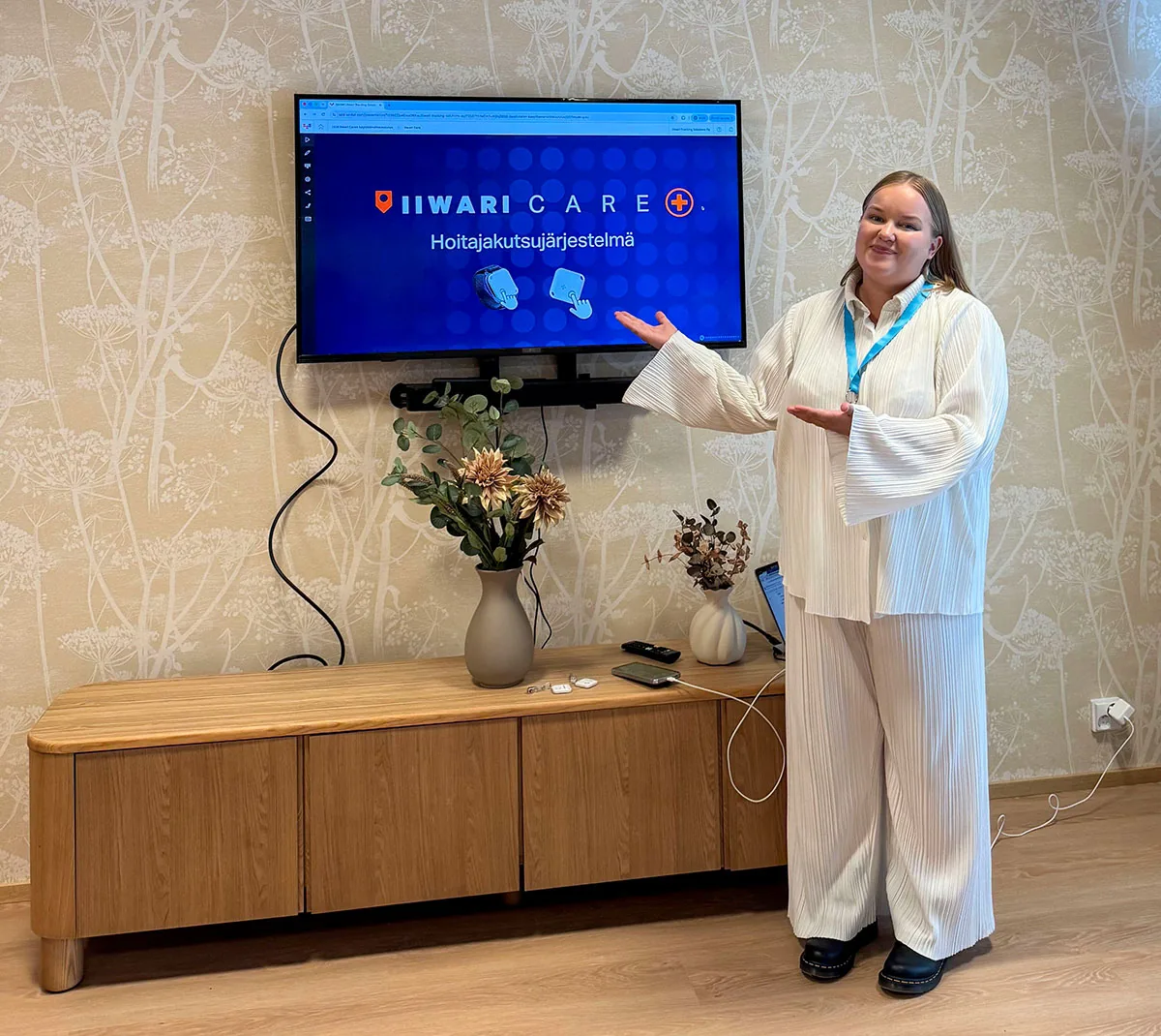
Avoid these
- Dark filters or overlays on photos
- Changing the aspect ratio of an image
- Invented app views, wristbands or tags
- Outdoor scenes with the system – positioning works indoors
Icons
Icons are simple, linear and evenly weighted, with orange as the accent. The check mark in lists is always a filled orange circle with a white tick.





Brand
Messaging and tone of voice
We communicate clearly and concretely. Nurses and residents come first, technology stays in the background. We do not overpromise and we never talk over people.
Core logic
A real-time picture of the whole building.
Knowledge of what happened and where.
Help is directed to the right place immediately.
Safer everyday life for residents and nurses.
Tone of voice
- Plain language, no technical jargon.
- Concrete benefit before feature.
- Respectful towards nurses – we do not measure people, we support their work.
- Honest: we also state the limits, for example that positioning works indoors.
Writing rules
- Use en dashes (–), never em dashes (—).
- Product names: Iiwari Care, Iiwari Tag, tag, anchor.
- Never write “tile tag” – the correct term is Iiwari Tag.
- Numbers and units: 2–3 days, under 1 m, a 30-bed care home.
Questions about the brand or materials?
I'm happy to help with logos, images and communications. Get in touch if you need materials or want to check that your use follows these guidelines.